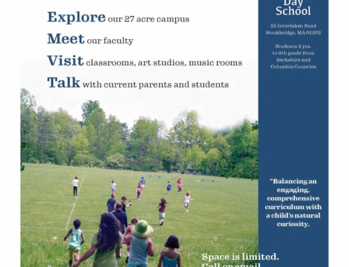
From Robin Williams’ The Non-Designer’s Design Book [ aka…the c.r.a.p. principles ]
PROXIMITY
· Group like items together
· Move related items into close physical proximity in order to form a cohesive group
· Items that are not related to each other should not be in close proximity
ALIGNMENT
· Every item on the page should have a visual connection with something else on the page.
· Nothing should be placed arbitrarily
· When items are aligned on the page it creates a stronger cohesive unit
· The principle of alignment is what tells readers that even though items are not close to one another, they belong to the same piece.
· Gives a sense of order and intent
REPETITION
· Repeat some aspect of the design throughout the entire piece
· Gives a sense of consistency to the page
· Repetition unifies all parts of a design
· Gives the mind a pattern to follow
· A unifying element that gives the mind a way to make meaning of the overall piece
CONTRAST
· If two items are not exactly the same, then make them distinctly different
· This is one of the most effective ways to add visual interest to the page
· Examples of contrasting elements:
- Large type with small type (18pt with 10pt)
- Graceful oldstyle font with a bold sans serif font
- Horizontal element [like a long line of text] with a vertical element [a tall, narrow column]
- Widely spaced lines with closely packed lines


